This guide explores different types of graphs and considerations for their implementation in various domains.
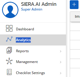
You can find the Analytics section in the side menu as shown in the below image
You can find a variety of graphical representations based on your requirement to showcase your data whether in numbers, series, or ratio trends and various other formats. A few of the Analytics samples are shown below for your reference ;
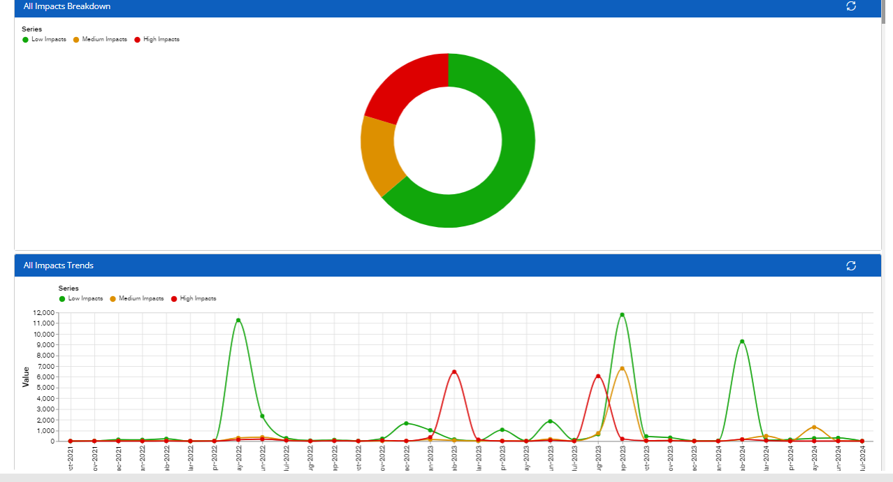
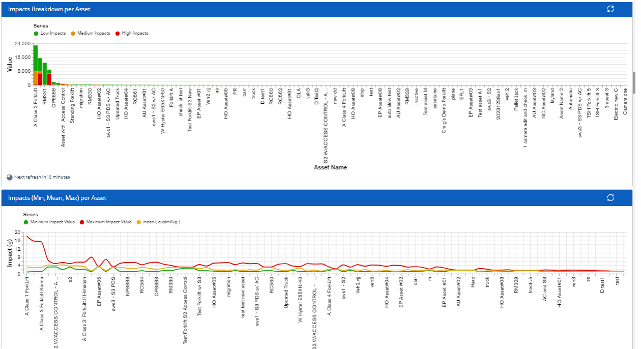
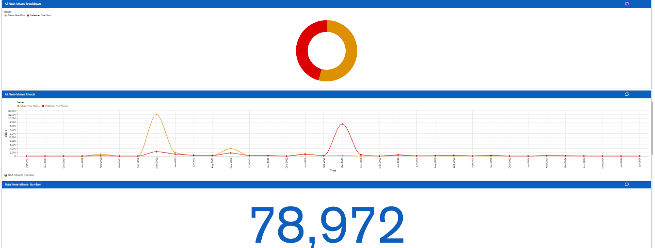
As shown above, in the screenshots, the Analytics section helps you showcase and handle large-scale data graphs efficiently and choose appropriate algorithms and data structures based on graph characteristics.
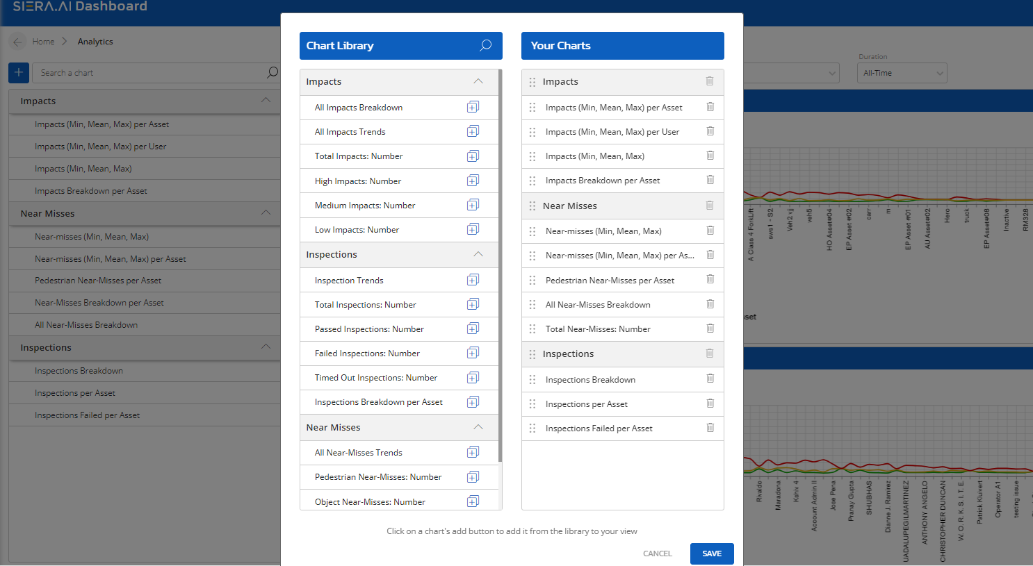
Once you click on the Plus icon, you will get the list of the following charts that have been added already and are available for you.
You can simply drag and drop new charts from there based on your preference and click on the Save button as shown below ;
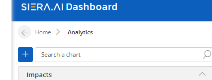
Analytics section by default shows you the data visualization available on the dashboard however you can add new charts based on your preference by clicking on the Plus Icon as shown below;’
The graphical data automatically refreshes every hour by default. Additionally, you can manually refresh it by clicking the refresh button located in the top right corner of the screenshot below.
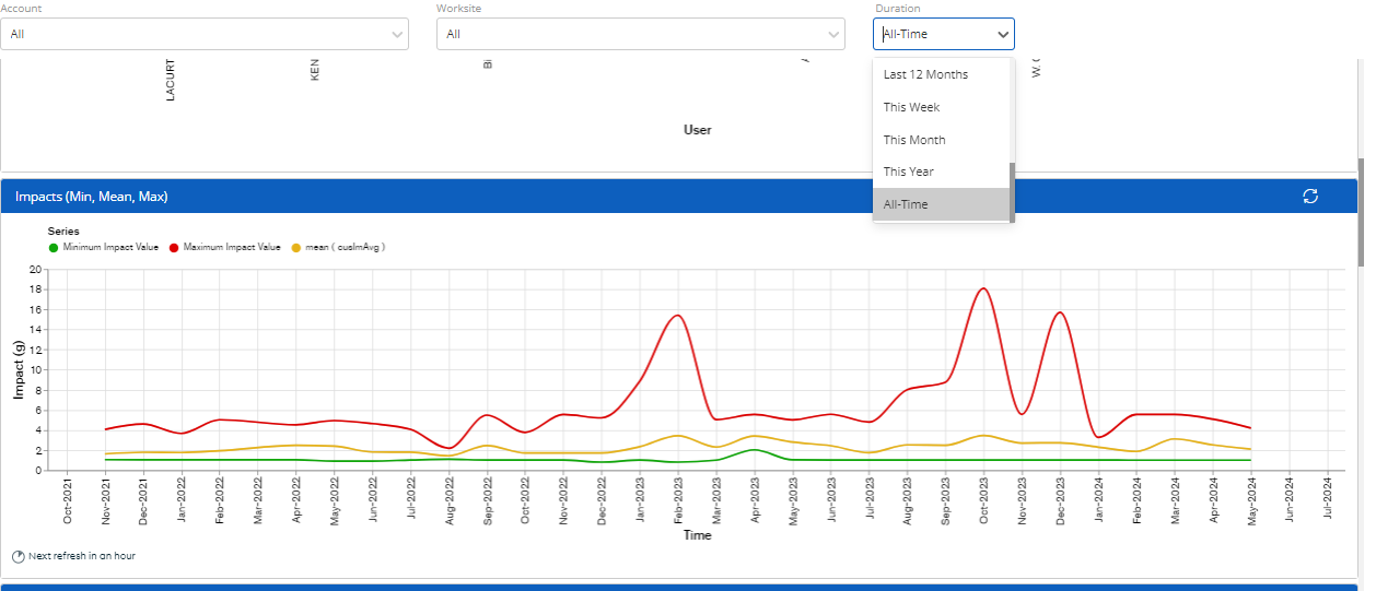
Also, you can check out the data in various time durations like week, month year, etc as shown above in the snippet.
Conclusion
We are always open to your suggestions on adding new types of charts that you would like to see. If you want a new type of metric to be charted, please send your recommendations to support@siera.ai. If found feasible, we would develop and include it in the next build release.